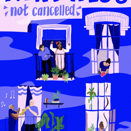
Unity
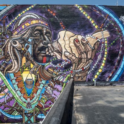
Add Fuel began his career under the full name Add Fuel to the Fire. Early on, he first created a dark yet exuberant visual universe populated by slimy, eccentric and joyful creatures. This work was influenced by a variety of interests–from video games, comics, and animation, to sci-fi, low-budget films, designer toys, and urban visual culture.
In 2008, he became fascinated with the aesthetic possibilities of symmetrical patterning and tessellations. He shortened his moniker to Add Fuel. The focus of his art shifted to reinterpreting the language of traditional tile design, particularly the Portuguese tin-glazed ceramic azulejo. His current practice blends these two seemingly irreconcilable visual idioms. He combines traditional decorative elements with contemporary visual referents in new forms that reveals a complexity and a masterful attention to detail.
On its face, his work in smaller tile panels, large-scale stenciled murals, and print editions might seem simply a pastiche of classic formalism. However, a closer inspection reveals a chaotic world of original motifs and characters brimming with irony and humor. The symmetrical repetition of his work creates balance and harmony. His multi-layered, patterned compositions use layering and visual illusion techniques like trompe-l’œil to produce a poetic rhythm. The resulting work plays with the viewer’s perception and the (many) possibilities of interpretation.
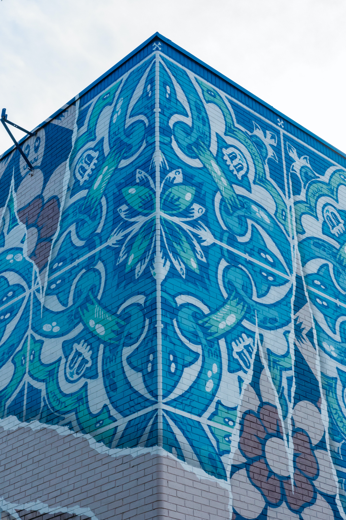
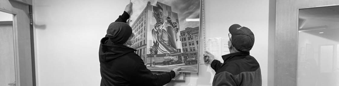
Diego Machado, Unity, 2019. Acrylic and latex on wall, 55 x 32 ft. Public art. ©Diego Machado. All rights reserved.
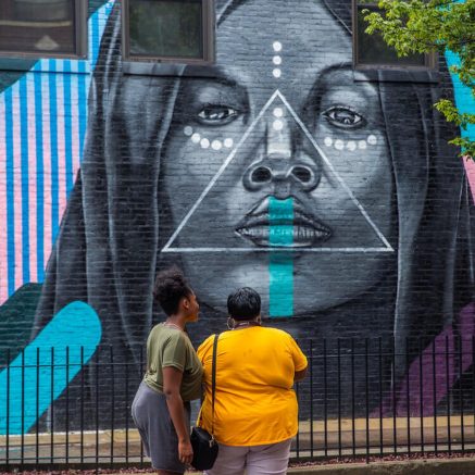
Chelsea HealthCare Center staff identified Portuguese as one of the sites' major patient populations. The Azulejos tile design is well known in Portuguese culture. Of note, the word azulejo has nothing to do with the color blue, rather it is derived from Arabic term for zellige, a style of mosaic tilework. The blue and white color scheme, now stereotypical of azulejos, was introduced in the second half of the 17t century--borrowed from the Dutch Delft pottery tradition. Regardless, blue is a soothing color to many.
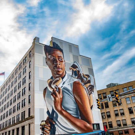
The artist chose the brick wall for his mural because he imagined under the brick could be wallpaper, and under the wallpaper could be this tile, like in many Portuguese homes.